
2024 Personal Project
In Development
Role: UI/UX Design, User Research, Information Architecture, 3D Designer
Duration: 6 Weeks Development
Tools: Illustrator & Figma
About
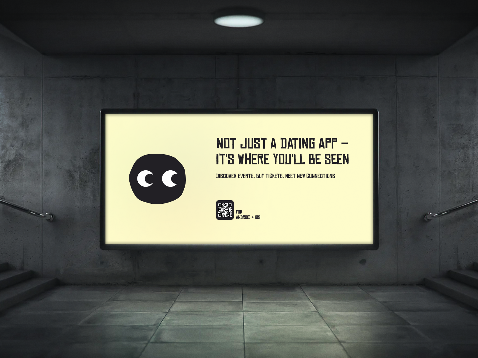
No Ghosting, No Swiping, Just like in real life.
SEEN is a UK-based ticket event application featuring a unique connection/dating feature designed to foster genuine connections through real-life events. The aim is to combat the negative aspects of online dating, particularly prevalent among younger generations creating authentic social connections.
How Does it Work?
Discover: Browse through a curated selection of events based on your interests and location.
Attend: Purchase a ticket for an event you're interested in attending.
Unlock Matches: Gain access to potential matches attending the same event.
-
In today's digital dating landscape, individuals encounter significant obstacles in forming genuine connections. The closure of numerous UK night-time venues, alongside mental health challenges posed by online dating apps, adds to the issue. Despite approximately 35% of individuals traditionally meeting through events, this trend is now hampered by venue closures. As online dating apps become the primary method of meeting potential partners, users struggle with overwhelming matches, safety concerns, and ghosting, impacting mental well-being, especially among younger users. Additionally, the prioritisation of work/life balance further complicates the dating experience. There's an urgent need for a solution to foster meaningful connections while revitalising the nightlife scene.
-
SEEN is an event app designed to address the challenges of modern dating and the decline in event/night life in the UK. By creating a recommended event app that facilitates connections and matches once a ticket has been purchased, SEEN addresses the need for meaningful interactions in a natural setting. The app aims to encourage users to attend more events through curiosity of potential matches, fostering connections with others who share common interests. This approach extends beyond the dating scene, providing users with opportunities to connect with like-minded individuals. With the ability to match a week before the event starts and arrange meetings before or after, SEEN empowers users to forge genuine connections while revitalising the nightlife scene.
-
To create an event-based app that fosters meaningful connections among users, promoting real-life interactions and revitalising the social scene.
Connect: Explore profiles of other attendees and connect with those who catch your interest.
Meet Up: Chat with your matches and arrange to meet at the event for a chance to connect in person.
Grow: Grow your social potential.
Primary Research
Research & Analysis
In order to address the issue on the closures of event venues and dating applications I began a thorough research and investigation on the topics through various methodologies which include findings of secondary and first hand data analytics of current dating trends alongside conducting user interviews to identify specific pain points and potential solutions to create an application that can encourage and aid genuine connections thorugh events.
Key Research Statistics
- 32% of nightclubs have closed since 2021*a
- 6% decrease in profits from electronic music generated a £2.5 billion contribution to the UK's economy*b
- 9% increase of for UK festivals to £567.8m*c
Engagement time on dating apps:
- Hinge and Bumble: 2+ hours
- Grindr: 6+ hours
- Tinder: 1 hr 12 mins
Success rates:
- Overall decreasing, except for Hinge.
- Hinge saw a 1.08% annual increase.
Meeting methods:
- 15% met people while they were out and about
- 7% found love through an online dating platform.
- 6% found love through dating apps.
- 5% mentioned meeting due to shared hobbies.
- 3% met through family recommendations.
Age Statistics
- Age 20 to 29: Only one in twenty people met their partner at a bar or elsewhere by chance.
- Age 50 to 64: One in five people met their partner by chance while out and about.
- Age 25 to 34: Over a fifth met their partner online 13% through dating apps and 9% through websites such as OKCupid or Guardian Soulmates.
- Age 40 to 44: One in nine met their partner on a website (11%), while apps are somewhat more unusual at 7%.
*Based on UKGOV Surveys 2023
Mental Health & Online Dating
According to NCBI* Swipe-Based Dating Applications (SBDA) users report higher levels of depression, anxiety and distress compared to those who do not use the applications frequently.
Mental benefits of Online Dating:
Eases social anxiety by providing a gradual progression of relationships.
Matches based on psychological profiles and interests, reducing pressure.
Negative Effects:
Depression and Isolation: Frequent rejection and ghosting lead to self-esteem issues and loneliness.
Anxiety: Profile creation and constant checking can cause anxiety and self-doubt.
Addiction: Dating app addiction is comparable to technology addiction.
Impatience: Creates unrealistic expectations and a desire for immediate gratification.
Difficulty forming in-person relationships: Reliance on apps makes face-to-face interactions challenging.
Self-esteem issues: Focus on physical appearance can lead to self-esteem issues.
Rejection: Constant exposure to rejection impacts self-esteem.
25-35 year olds represent 20% of UK online dating users.
Young people are less likely to ‘bump into’ the love of their lives.
Part 1: Empathise, Define & Ideation
01. Primary Competitor Analysis
Empathise, Define & Ideation
Through a comprehensive competitor analysis of social apps, the aim was to understand existing features and functionalities to find areas of improvement and opportunities. The ultimate goal was to g ather insights and best practices to enhance the functionality, security, and user engagement of our own platform. Additionally, further investigation in the app stores reviews per competitor was also undertaken to identify potential pain points.
-
1. Increase social longevity by fostering connections through established common interests.
2. Introduce error/return features currently exclusive to premium subscriptions, free of charge in the SEEN application.
3. Broaden user target audience by offering more options for LGBTQ communities.
4. Explore alternatives to swipe-based interactions to alter the psychology of rejection.
5. Enhance safety features beyond basic blocking mechanisms.
6. Offer reduced booking fees for artists promoting events and for customers. -
1. Implement curated feeds within the events feature, allowing users to select music preferences and integrate with Spotify or similar applications for additional data.
2. Provide easy and illustrated onboarding process for new users.
3. Enhance safety features like blocking and introduce a 'resell' feature for unwanted tickets.
4. Introduce additional safety measures to prevent stalking, such as delaying profile matching closer to the event date.
Empathise, Define & Ideation
02. User Interviews
To gain a better understanding of the current user, a series of interviews were held to gain insignt on current dating trends and use of social apps.
Participants: 20
Setting: Both online and London, UK location.
Ages: 22-56
Interview Goals:
Explore user behaviours and preferences surrounding event discovery and ticket purchasing processes to identify pain points and opportunities for improvement in existing event ticketing platforms.
Investigate user attitudes and motivations towards integrating social networking and dating features within an event ticketing platform.
Identify social attitudes towards using dating applications and define ‘natural’ methods of meeting new connections.
Gain insights into the competitive landscape of event ticketing and dating apps to identify unique value propositions and differentiation opportunities.
Key Quotes
"The dating scene as a single parent can be scary, especially when balancing responsibilities."
- Jamie, Age 35
“I want to meet new people, but my busy schedule and anxiety makes it challenging” -
Mia, Age 32
"I would like to meet like minded people. I can never find people my age who still like to party, including my husband. I tend to just go out on my own. It would be nice to make some friends! "
- Linda, 62
"I enjoy going out and meeting new people, but I worry about my safety meeting someone online"
- Sophie, Age 21
“It’s harder for me to find someone at my age when I am already so set in my ways, especially with family and work commitments. I tend to just see my friends so I don’t really have any time or confidence to date again.”
- Dan, Age 51
"I really want to be able to make friends. I am new to the city. "
- Koye, 34
03. Empathy Mapping & Pain Points
Empathise, Define & Ideation
Through aggregated empathy mapping user paint points began to emerge with a common theme of self value through swipe based applications.
a) Aggregated Empathy Diagram
Pain Points
I need to find connections without feeling rejected on my appearance.
I need to find connections without pressure.
I want to connect with others thorugh mutual interests.
I need to feel valued online.
I need more variety in my dating and social life.
I need to feel sage when meeting strangers.
I don’t want to waste my time on my phone.
Empathise, Define & Ideation
04. User Journey Map & Flow
A s a method to explore opportunities user journey maps were created based on the usability of a social event ticket application. With connection to the previous interviews it became apparent that an option to turn off connection finding would bring the user.
1. Safety
2. Flexibility to use without needing to be single/looking for connection
Before proceeding to the design phase, it was important to find three main user flow diagrams for the application in order to accomplish the goals of:
1. Onboarding: Due to the complexity of the application it was important to find a simple flow into the desired goal of creating both a dating profile and or/ normal sign up profile. Providing this option would therefore reduce the stigma of data apps based on prior research as well as the flexibility to use the application as a ticket purchase platform. This would increase the market of users.
2. Purchasing a Ticket: The flow is aimed to optimise the users end goal by providing promts on whether the user would like to find an event based on highest rated potential matches or on personal music preferences. This filtered platform reduces overstimulation of inforation.
3. Matching with Connections: The flow is an extended flow of purchasing a ticket however with two additonal options of being able to match after a purchased ticket, searching for an event with the highest connectoin match or via already purchased tickets. The flow was designed to maintain as efficient and lest confusing methods as possible.
05. Value Proposition & Problem Statement
Empathise, Define & Ideation
Through the interview process, four common themes where revealed with potential for a unique user experience that merges both the events and social mobile application.
a)Value Proposition Analysis
Goal Statement:
Our ticket buying app will let users find connections which will effect how individuals date/socialise by allowing individuals to meet new people at any event. We will measure its effectiveness by how many users decide to meet again/continue these connections.
The Problem:
How might we create an incentive for artists/event coordinators to host their events on a social app?
How might we create a more efficient way of making connections in real life at music events?
How might we create a safer and traditional way of making connections?
How might we help users meet new connections during their leisure time?
How might we help users find a safe space with like-minded individuals?
Part 2: Design & Test
Design & Test
01. Sketching
I conducted wireframing for my app SEEN to create a clear and user-friendly interface. After a few iterations, I realised the need for a feature to simplify the filter process, organising different events into sections for easier navigation. Additionally, I decided to include icon features such as plus and minus buttons for ticket purchases and a confirmation page for payment to enhance the user experience and streamline the transaction process. The final sketches below represent the features I wished to include.
Design & Test
02. Information Architecture
Before creating a low-fidelity prototype, I planned the information architecture due to the complexity of the app. I aimed to create a central hub on the home page, encompassing all main features for easy navigation. I integrated both ticket/event pages and matching features while ensuring a clear distinction without overwhelming users. To achieve this, I simplified the navigation into four main points: 'event browsing', 'ticket wallet', 'browse matches', and 'matches with conversation chats'. Additionally, I included a custom feature for application settings and a user profile section, which encompasses both music preferences and the matching profile. These preferences are linked to the information used for matching with other users and the types of events shown to the user. The information architecture diagram below represents these features.
Design & Test
03. Wireframing
The information architecture greatly influenced the development of my low-fidelity prototype for SEEN. I applied Gestalt Principles, including Proximity, Similarity, Continuity, Closure, Symmetry, Figure-Ground, and Simplicity. These principles guided the design, ensuring clear containment of events and consistent boxing for written information, creating an intuitive and visually cohesive user experience.
Design Features (Preview Markup Image for highlighted features)
Fast Selection Menu: The fast selection menu allows the user to filter through vast amounts of events to their desired requirments. This could be for events on the day, during the week, a specific month, artist, proximity and their Spotify artists.
Music Preview: A music preview to allow the user to discover more events based on the artist or event that is being featured.
Event Filter: Events are highlighted in mini previews and when clicked on open a wider list of events to minimise information overload.
High Match potential Icon: A high match potential based on another users interests is shows to entice the user to purchase a ticket and discover their high match potentials.
Match event attendance: Once a user has purchased a ticket and matched with other users, the event in which their match is attending is highlighted as part of their profile.
Match Recently Listened To: Users are able to see what potential matches have listened to, encouraging topics to discuss between users.
Reply Promts: Users are given promts and discussion topics to reply to when matching profiles.
Ticket Resell: A ticket resale button to allow users to exchange tickets that they may not be able to attend. However this does not guarantee a re-sell.
1) Feature Markups
Design & Test
04a. Usability Testing Results
The information architecture greatly influenced the development of my low-fidelity prototype for SEEN. I applied Gestalt Principles, including Proximity, Similarity, Continuity, Closure, Symmetry, Figure-Ground, and Simplicity. These principles guided the design, ensuring clear containment of events and consistent boxing for written information, creating an intuitive and visually cohesive user experience.
-
1. Optimising User Experience: Investigate user preferences and behaviours to identify the most effective ways to integrate event discovery and social connection features within the app. Conducting user surveys, interviews, and usability testing to understand user needs and preferences.
2. Minimising Cognitive Load: Explore strategies to simplify the app interface and user journey to reduce cognitive load and avoid overwhelming users. This could include evaluating different design layouts, navigation structures, and information presentation methods to ensure ease of use and seamless interaction.
3. Enhancing Social Integration: Examine methods to foster a sense of community and social connection among app users. A study on user profiles, messaging capabilities, and social networking functionalities to facilitate interactions and relationship-building within the app.
4. Addressing Safety Concerns: Investigate ways to mitigate safety concerns associated with meeting strangers at events facilitated by the app. This could include implementing safety features such as user verification processes, reporting mechanisms, and privacy settings to ensure user security and wellbeing.
5. Measuring Impact on Mental Health: Assess the potential impact of the SEEN app on users' mental health and wellbeing. This could involve conducting longitudinal studies or surveys to evaluate changes in users' self-esteem, confidence, and overall mental health outcomes as a result of using the app to foster real-life connections.
Design & Test
05. Branding & Identity
The app's logo features a green circle face with two eye emojis, symbolising the fun and social nature of nights out. The colour palette is predominantly muted and black, which helps the vibrant event posters stand out, ensuring the app maintains a clean and modern look. Accents of yellow are strategically used for buttons and action points, adding a touch of brightness and guiding user interactions. The typographic choices blend modern grunge with a clean sans-serif font, balancing edgy aesthetics with readability. This combination of visual elements underscores SEEN’s commitment to enhancing real-life social connections through technology.

Design & Test
06. Hi Fidelity Mockups
-
1. Optimising User Experience:
To optimise the user experince it was important to create an onboarding introduction to the application due to the dual function as a social and ticket application. Users are able to opt out the matching profile if they are not looking for matches and can create a profile later if needed.
2. Minimising Cognitive Load:
To minimise cognitive load, the application utilises various filtering and categorising of events which minimise information overload.
3. Enhancing Social Integration:
Users are shown highest match potentials for events allowing for curiosity of a poential match whilst also increasing sales for the event. The matching profiles also showcase various conversation starters and promts which includes 'recently listened to' and previously attended events.4. Addressing Safety Concerns:
Users are given the choice to remain invisible and to block specific users or social accounts that have been linked to the application.
5. Impact on Mental Health:
Based on the previous interviews it was important to create a feeling of not being rejected. SEEN uses a refresh button stead of a rejection action. This reduces the stigma of current data applications.
Onboarding:
Ticket Purchase
Matching & User Chat:
07a. Design Updates & Feedback
Design & Test
Summary of Design Changes Based on User Feedback
Incorporate Instagram Connection in Onboarding
Add an option for users to connect their Instagram accounts during the onboarding process for enhanced profile creation and image selection.
Redesign Ticket Download Page
Feedback highlighted confusion regarding ticket download steps, prompting a redesign for clarity. Remove the existing ticket sign and redesign the page to make the ticket download process clearer. Implement a separate page dedicated to downloading tickets.
Improve Chat Interface
Users found the chat button hard to locate and the typing button design odd, leading to an improved and more intuitive chat interface.
Enhance Event Search and Ticket Purchase Flow
Users suggested simplifying the event search process and making the purchase flow more intuitive.
SEEN Visibility Toggle Improvement
Ensuring that the visibility toggle is easy to locate and use, based on user feedback.
Add ‘How Does It Work’ Page
Include a new informational page that explains how the app works to help users understand its functionalities better.
Improve Download and Connect Page
Redesign the download and connect page to make it less confusing. Consider creating an additional page specifically for event ticket downloads to streamline the process.
Showcase Matches per Event
Implement a feature that allows users to see matches specific to each event.
Enhance Fast Menu Buttons
Make the fast menu buttons on the homepage clearer and give the play button more emphasis for better navigation.
Highlight Navigation Menu Selection
Add emphasis to the navigation menu items when selected, such as making them bigger or highlighted for better use of UI design.
Remove ‘Online’ Status in Chats
Remove the ‘online’ status indicator in user chats to prevent feelings of rejection if messages are not promptly replied to.
07b. Design Updates & Feedback
Design & Test
Incorporate Instagram Connection in Onboarding
Add an option for users to connect their Instagram accounts during the onboarding process for enhanced profile creation and image selection..
Design & Test
07. Prototype

Lessons Learned
The information architecture greatly influenced the development of my low-fidelity prototype for SEEN. I applied Gestalt Principles, including Proximity, Similarity, Continuity, Closure, Symmetry, Figure-Ground, and Simplicity. These principles guided the design, ensuring clear containment of events and consistent boxing for written information, creating an intuitive and visually cohesive user experience. The application however lacks research that would be more comprehensive towards informing the design. The project would have been far more successfull with a longer User Research timeline as the application is more human driven.


